Create custom components
Create custom components to add your own UI elements into workflows.
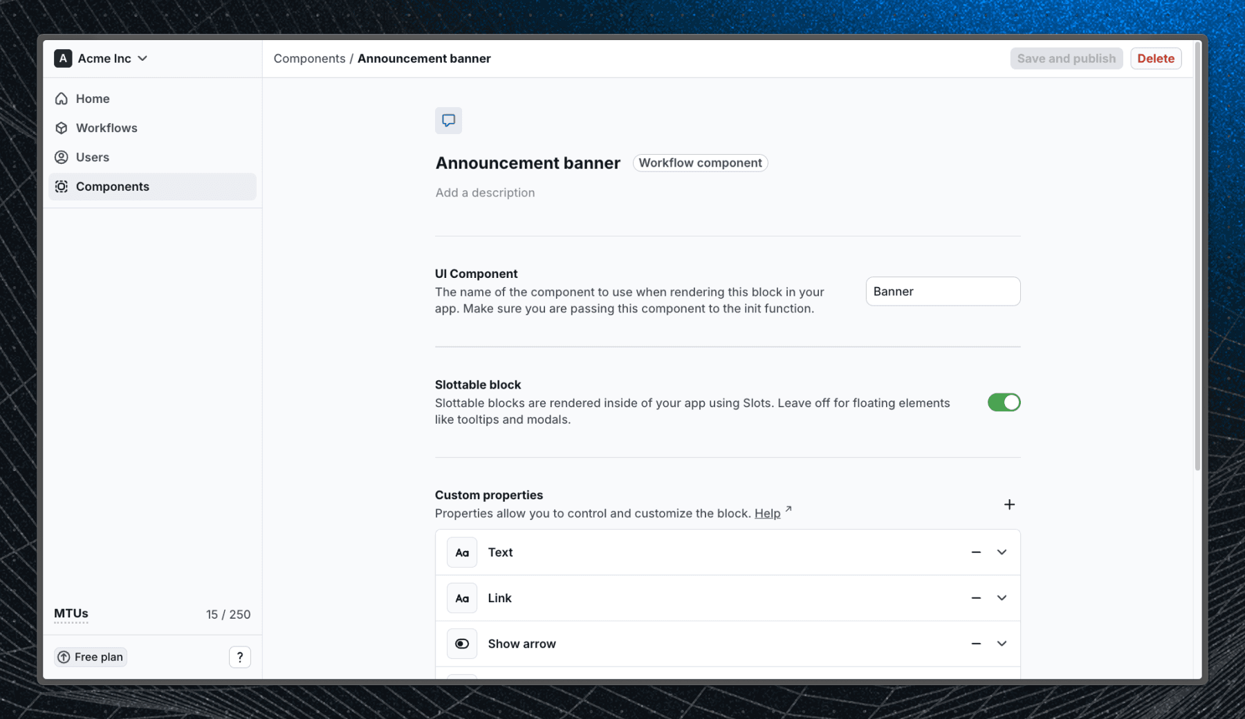
Custom components can be created in Flows. Components definitions store the properties and exit nodes for your custom component so Flows knows how your components work. Each component requires a corresponding UI component in your application.
Create a UI component
First, create or reuse a component within your application. This component will be rendered when users enter the block in a workflow.
In this guide, we’ll build a marketing banner with the following customizable properties:
- Title
- Description
- Button label and link
- Option to hide a close button
If you would like to add different properties to your component, you can use the following types:
stringnumberboolean- select (dropdown) -
"foo" | "bar" | "baz"
import { ComponentProps } from "@flows/react";

type Props = ComponentProps<{
  title: string;
  description: string;
  buttonLabel: string;
  buttonLink: string;
  hideCloseButton?: boolean;
}>;

export const MyBanner = (props: Props): ReactNode => {
  return (
    <div>
      <div>
        <h2>{props.title}</h2>
        {!props.hideCloseButton && <button>X</button>}
      </div>
      <div>
        <p>{props.description}</p>
        <a href={props.buttonLink}>{props.buttonLabel}</a>
      </div>
    </div>
  );
};
Add exit node props
Now we will add exit node props that will allow Flows to react to user interactions with the block. Let's add complete and close props that will be called when the user clicks the button or the close button.
import { ComponentProps } from "@flows/react";

type Props = ComponentProps<{
  title: string;
  description: string;
  buttonLabel: string;
  buttonLink: string;
  hideCloseButton?: boolean;
  complete: () => void;
  close: () => void;
}>;
In case of a tour component, you should use TourComponentProps from @flows/react package. This will give you access to previous, continue and cancel props that are used to navigate through the tour. Survey components work the same way with SurveyComponentProps, which supplies survey, complete and cancel.
import { TourComponentProps } from "@flows/react";

type Props = TourComponentProps<{
  title: string;
  description: string;
  buttonLabel: string;
  buttonLink: string;
  hideCloseButton?: boolean;
}>;
And then use these props in the component:
export const MyBanner = (props: Props): ReactNode => (
  <div>
    <div>
      <h2>{props.title}</h2>
      {!props.hideCloseButton && <button onClick={props.close}>X</button>}
    </div>
    <div>
      <p>{props.description}</p>
      <a onClick={props.complete} href={props.buttonLink}>
        {props.buttonLabel}
      </a>
    </div>
  </div>
);
Add component into the Flows provider
To make the component available to Flows, you need to add it to the FlowsProvider in your application. Register it in the object that matches its type: components for a workflow component, tourComponents for a tour component, surveyComponents for a survey component. A component registered in the wrong object never renders.
import { FlowsProvider } from "@flows/react";
import { MyBanner } from "./banner";

const App = () => {
  return (
    <FlowsProvider
      organizationId="your-organization-id"
      environment="your-environment"
      // Add tour specific components here
      tourComponents={{}}
      surveyComponents={{}}
      components={{
        Banner: MyBanner,
      }}
    >
      {/* Your app code here */}
    </FlowsProvider>
  );
};
Create a component in Flows
Now that we have our UI component, we can create a component in Flows. Navigate to Components and click New component.
A dialog will appear where you need to enter a name for the component and pick its type: Workflow component, Tour component or Survey component.
Specify component
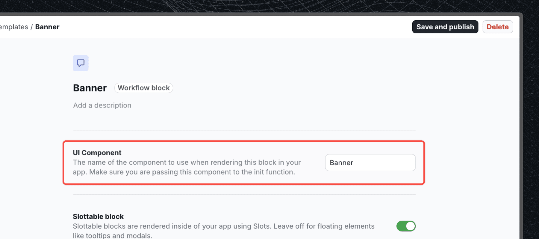
To tell the Flows SDK which component to use, you need to enter the key you used in the components object passed to FlowsProvider. In our case, it's Banner. For a tour or survey component, use the key from tourComponents or surveyComponents.
Select if the component is slottable
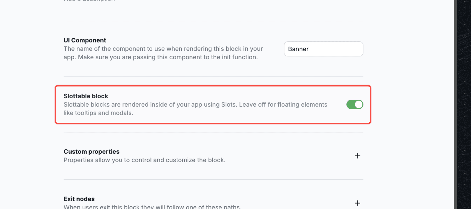
If your component is intended to be rendered inside the application, you need to select the Slottable option. This will allow you to specify a slot id when adding the block to a workflow. In our case, the banner component is /slottable because we want to embed it into our application UI.
Define block properties
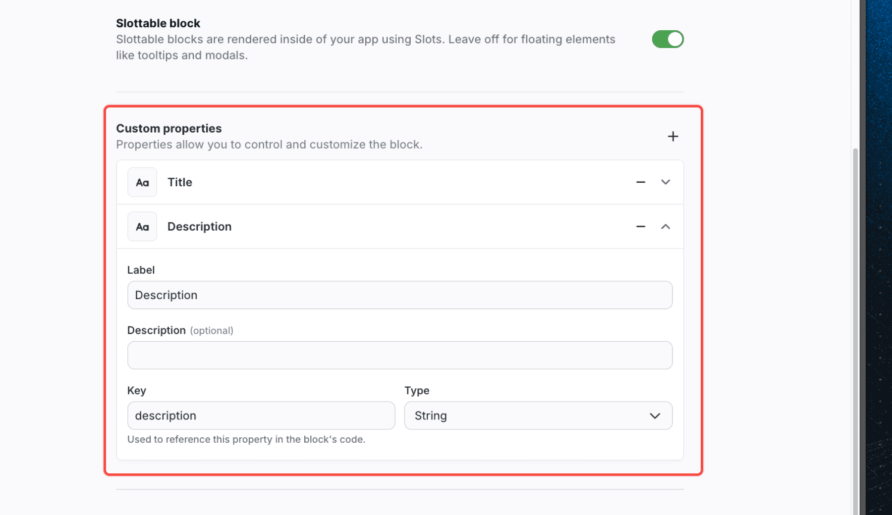
Block properties are the fields that your editors can customize when they add the block to a workflow. They are the same as the props you defined in your component. For our banner component, we'll add the following properties:
| Name | Key | Type |
|---|---|---|
| Title | title | string |
| Description | description | string |
| Button label | buttonLabel | string |
| Button link | buttonLink | string |
| Hide close button | hideCloseButton | boolean |
Each property has:
- Title - the name of the property
- Description - a short description of the property for the editor (e.g. instructions)
- Key - the key that will be used to pass the value to the component
- Type - the type of the property
Add exit nodes
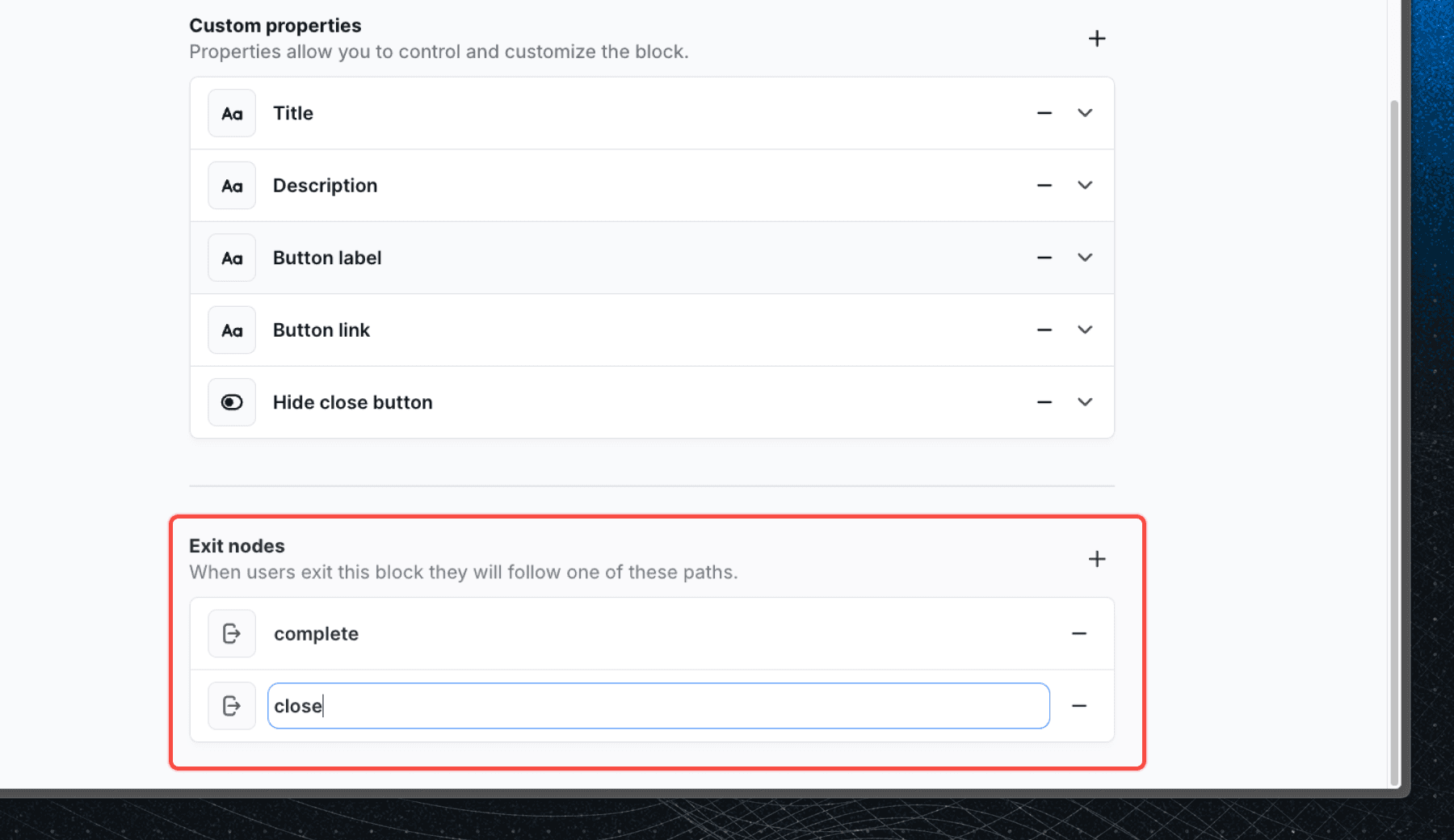
Exit nodes are the transitions that can be triggered when the user interacts with the block. For our banner component, we'll add two exit nodes:
complete- when the user clicks the buttonclose- when the user clicks the close button
The exit node has only a key field that needs to match the prop name in your component.
Exit nodes on tour and survey components
Tour and survey components do not have an editable exit node list. Their exit nodes are fixed by the block they live in, so the component page shows them as a read only list instead of a form:
- Tour component:
continue,previousandcancel, matching the props you get fromTourComponentProps. - Survey component:
completeandcancel, matching the props you get fromSurveyComponentProps.
There is nothing to add by hand and nothing to double wire. You cannot define extra custom exit nodes on a tour or survey component. If a step needs to branch somewhere other than the next step, put that logic in the workflow after the tour block, or use a workflow component outside the tour.
Optional: More customization
You can also change the icon of your component by clicking on the icon above the component name.
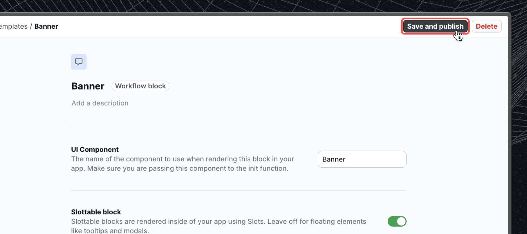
Save and publish
Once you've defined your properties and exit nodes, click Publish changes to make the latest version of the component available to use in your workflows.
Add block to workflow
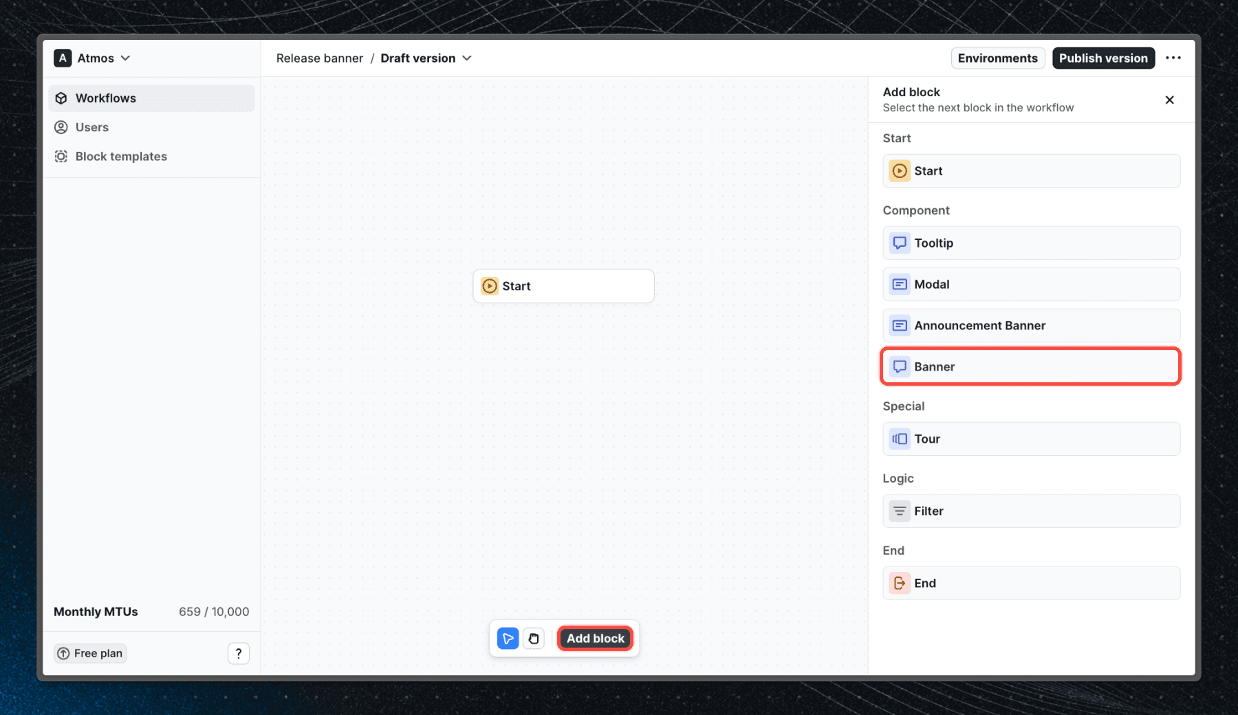
Now that we have our component, we can add it to a workflow. Navigate to a workflow and click Add block. Select the component you created and configure the properties.
Finish the workflow
Once you've added the block to the workflow, you can connect it to other blocks and paths to create a complete workflow. Users will see your custom component when they reach the block in the workflow.
Next steps
Now that you know how to create custom components check out our live examples with source code to see what you can build with Flows.
Last updated on